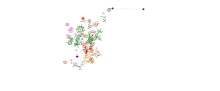
Because the range of jobs in the healthcare field is so complex, network visualization of interrelationships between disciplines can yield insights into just how vast the healthcare system is. Making a network graph to display the range of jobs is… Read more ›
IMPACT, which stands for Improving Massachusetts Post-Acute Care Transfers, is an Office of the National Coordinator grant-funded project designed to improve care transitions using an enhanced electronic Universal Transfer Form (UTF) and electronic health information exchange. [For details see: http://mehi.masstech.org/what-we-do/hie/impact… Read more ›
The Centers for Medicare & Medicaid Services (CMS) has developed data that enables researchers and policymakers to evaluate geographic variation in the utilization and quality of health care services for the Medicare fee-for-service population. They have aggregated this data into… Read more ›
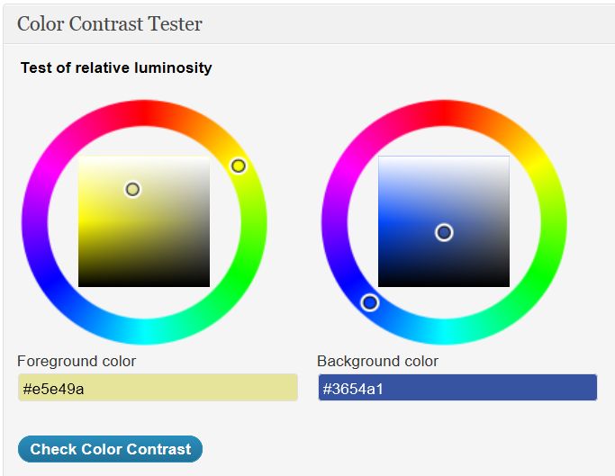
The Web Content Accessibility Guidelines (WCAG) 2.0 specify that there needs to be enough contrast between text and its background so that it can be read by people with moderately low vision (who do not use contrast-enhancing assistive technology). Here… Read more ›
“Responsive” means that a web theme will adapt as needed when appearing on mobile devices such as tablets and smartphones. As screen sizes change, layouts must adapt to the limits of the device they are running on. Some sites achieve… Read more ›
Here is a survey of font resizer plugins for WordPress. Ability to increase font size can be an important tool to increase accessibility for users with limited visual acuity. Although users can change the font size of a web page… Read more ›
Visual acuity tends to decline as we get older, but few sites dealing with senior issues make a strong effort to have accessible design for the visually-impaired. Design issues include such things as resizable fonts, spatial arrangement of information, and… Read more ›
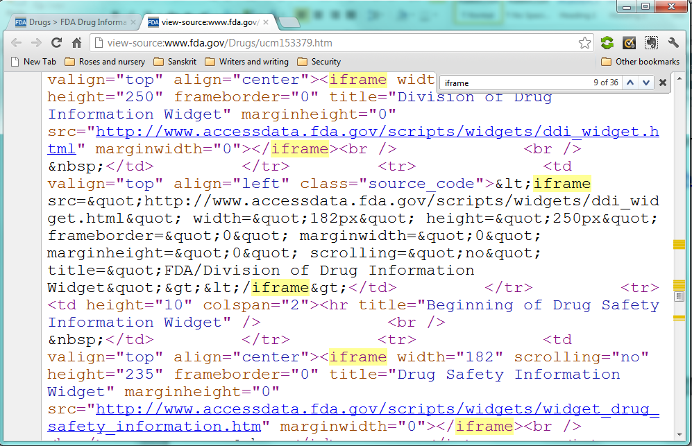
Yes, if you do it carefully, and mitigate the potential problems it can cause for some disabled users. The 508 Standards, Section 1194.22 (a), say that A text equivalent for every non-text element shall be provided (e.g., via “alt”, “longdesc”,… Read more ›
I use the Suffusion theme on a couple of WordPress sites and have found a simple way to make it play well on mobile devices without the need for a theme switcher. Just tweak a couple of things, and you… Read more ›
Thanks to the wonders of the Open Data initiative, you can download healthcare datasets from data.gov and analyze them using Google Fusion Tables. This method offers powerful visualization tools. And did I mention that it’s free? At the bottom of… Read more ›