Is your site unreadable due to poor color contrast?
The Web Content Accessibility Guidelines (WCAG) 2.0 specify that there needs to be enough contrast between text and its background so that it can be read by people with moderately low vision (who do not use contrast-enhancing assistive technology). Here is the guideline in a nutshell:
1.4.3 Contrast (Minimum):The visual presentation of text and images of text has a contrast ratio of at least 4.5:1, except for the following: (Level AA)
– Large Text: Large-scale text and images of large-scale text have a contrast ratio of at least 3:1;
– Incidental: Text or images of text that are part of an inactive user interface component, that are pure decoration, that are not visible to anyone, or that are part of a picture that contains significant other visual content, have no contrast requirement.
– Logotypes: Text that is part of a logo or brand name has no minimum contrast requirement.
Full guideline is at: Understanding SC 1.4.3
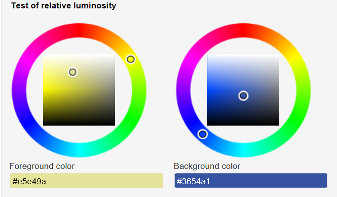
It is easy to check if your WordPress site meets these guidelines by installing the WP Accessibility plugin, which includes a color contrast testing tool among its many features. The color contrast checking tool doesn’t make any active changes to your web site, but allows you to easily test whether a pair of colors you’re considering for customization of your site meet the standards set by WCAG 2 for color contrast. Here is a screenshot showing the color selection panel within the plugin:

Screenshot showing the selection controls for the color contrast tester.
Here is a screenshot of the report, showing that the color combination meets the required contrast ratio:

Screenshot showing the accessibility compliance report for the color contrast tester.
